Wednesday, September 24, 2014

Portrait Series: Natalie Desiree, Wrapping Up


First of all, I’d like to apologize for the fact that my last update was in July.  Things have been in upheaval, though I haven’t stopped working.  I even have things in the backburner I’d like to write and talk about.  I just haven’t written about it, which there’s no excuse for.  Unfortunately, because of recent updates (I have a full time job now! And I moved to New York!), it will be hard to commit to posting more often but I do hope to soon after things settle and I feel more stable.

But, I’m here now, and I want to talk about the last portrait I did and part of the reason why I chose to undertake this process.

As I mentioned in my intro to this portrait series, part of my reason for making portraits was to shore up my portfolio.  However, there was a more pressing reason and part of it had to do with a fear I needed to overcome. 

In my illustration, I’ve noticed a trend that weakens my art: and that’s not pushing hard enough past limits.  What do I mean by that?  It’s really hard to explain, but basically, in art terms, it amounts to, for example, never pressing my pencil hard enough.  If I make a drawing, but keep a light hand, then I’ll have a really light drawing.  Since I’m aiming for some sense of realism, any sense of light (which is often essential to any good painting) is diminished if everything has a very light line to it.  Take this drawing for instance, which I made when I was around 20/21 (three years ago).

  
Ignoring the obvious lack of drawing skills, you can see that I attempted to incorporate some dark and light elements into the drawing, but they were so minute that it makes no difference.  What’s also important to note is that that drawing took me hours.  But a 5-10 minutes sketch now looks like this: 


As you can see, I’m much more heavyhanded with my darks and lights.

I have a similar problem when it comes to color.  I often have to tell myself, the shadow of a red object is almost never a darker red, yet that’s how I usually color.  I stick with a monochromatic palette with every object which isolates them, reducing the amount of realism in my paintings and making them feel less cohesive, like collaged elements rather than aspects of one complete painting.  The best way to describe what I mean is in this blogpost here, where the surroundings of a painting changes a different object in that painting. 

 Those self-diagnosed setbacks are why I wanted to do various portraits.  It’s always good practice in my B/W contrast drawing and because I specifically avoided realism, I was forced to consider color relationships and see how I can communicate lights and darks through wildly different colors.   And all that brings 
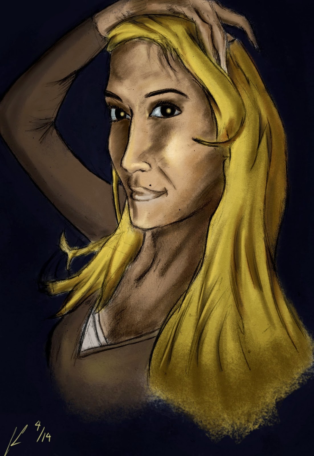
me to Natalie’s portrait.

Natalie had actually sent me a different photo originally, but soon afterwards, I took a break from making portraits.  In between that time, I was sent this photo.


It looked great and the fact that it was grayscale made me eager to start on the portrait since I’d be free from any push into a color direction.  As always, I started on a sketchbook.


[Note: This is a scanned picture of my sketch which was then altered in Photoshop with light adjustments - it's the first step I take after I scan a physical sketch]
I noticed that, like all my portraits, it wasn’t a complete replication.  Naturally.  Again, I was fine with this and liked it.  So I quickly moved onto color.  And in what seemed to be a pattern in my portraits, after a quick pass, it took forever for me to finalize things.  Part of it was my failure to realize the magnitude in which my drawing was off.  I should have stopped using Natalie’s photo as a reference because it threw me off but I was worried it didn’t look enough like her.  I couldn’t figure out what was wrong and then I realized that my drawing was at a flat angle, while her photo was from a higher angle.  Meaning her head slightly bigger because it was closer to the camera.  After I realized this, I was happy to let go of the picture and focus on the color. 

Another advantage about letting go of the photo was that I was fixated on having some sort of background, possibly related to the beach (where the photo was taken).  However, whatever variation I tried, whether in color or background, I was never really satisfied.  Then I asked myself, what if I just go with what I have now, which was, at the point, a kind of spacey, alien look.  Well why not?

So the portrait you see is very close to my original colors and look.  I decided not to try to fix something that wasn’t broken and after taking some time away from the painting, I liked it more.  


And with that, I end my portrait series.  I’d like to thank everyone who sent me a picture and I apologize for those whom I couldn’t capture in digital paint (unless it was a commission).  Thanks all, and I’ll be writing again real soon (promise).

Josue

Wednesday, June 4, 2014

The Power of Play

Process: Roaming (Monsters)


                There’s a point when you have a specific mastery or experience with a skill that you’re able to do things you wouldn’t have been able to when you first started.  I'm talking about play. 
                What do I mean, exactly?  There’s a saying I like to say (because I don’t know if it is a saying because I might have made it up).  “You can’t break the rules unless you master them first.”  I think about that, and I think about Picasso, who was a master draftsman and a master of his craft before he went on to Cubism, forging a completely new path and way of thinking for artists.  Dali had a similar skill in that his draftsmanship was so technically adept.  He was able to render anything realistically; so, he turned to surrealism. 

                Now, I am in no way saying that when I’m playing with my art, I’m breaking new ground.  I think that is what is possible (though limited to those who have nowhere else go but new).  But for the rest of us, we can sketch, play on our guitars, write or [insert other creative example here].  I think it’s a way of creating that has not been given enough credit.  When I first started drawing and illustrating, it would always be one of two things: 1) a study of another drawing/sketch, or 2) an attempt to create an image that was in my head.  Now, because I don’t get enough “inspiration” to start on a specific image (partly due to the fact that my process is now different), I literally doodle.

                Sometimes I don’t even look at the page, I just make pencil/pen marks, parallel lines, sharp angles, round objects, organic shapes, inorganic shapes.  Half the time, they don’t turn into anything.  The other half, there’s a semblance of an image, and half of those times I can usually develop a real sketch out of that. If I’m really lucky, I can turn it into a complete illustration.  This kind of process is something I’m sure most creative persons can relate to. 

                What I’ve learned is that you can’t rely on inspiration because that’s not something that really exists.  In the same way, writer’s/artist’s block doesn’t exist either – that’s your default state.  Creation comes out of creating, it doesn’t have to be a perfect start or even a perfect concept.  Just go for it and eventually your associations will turn your doodles into something.  I often turn my page to see what I’ve made at different angles.  Maybe from the initial drawing, I can’t make anything out of it, but if I turn it 25, 45, 80 degrees, it might start looking like something recognizable, something drawable (not a word, I know).  The best part, however, isn’t that you come out with a finished product (that almost never happens), but that you learn from it.

                Now, this wouldn’t be a blog post without some process!  Here’s a specific example of when play turned into something more complete. 

                The day was…some day in April.  I sat down on the couch to watch The Simpsons at the cusp of the evening.  With me were my materials – a sketchbook, a pencil, an eraser, and a sharpener.  In between laughs, commercials, and non-essential Simpson scenes (so like, 5% of the episode) I made staggered marks near the center of the page.  When I raised my head to continue watching, I continued making marks, eager to see what would coalesce by the next act break.  I looked down, nothing.  I turned my sketchbook, still nothing.  No matter, I just kept at it with my pencil.  After a certain amount of time (as in, The Simpsons finished), I looked down at the sketchpad.  My marks had created some kind of rock/natural structure.  It seemed primitive in construction, but I went with it and laid down a horizon line.  Now it looked like some kind of barren landscape with this strange oval-like formation jutting out of the ground.  My gears were turning – what if it was huge? What if people used it? What if people swung from it?  Millions of questions and ideas flooded in my head (they weren’t all good) and now I could draw with more deliberation.  I added tiny stick figures and swinging ropes, adding a dimension of scale to the sketch.  Here’s where I stopped (click to enlarge). 

                I had added a few more human-made structures but it didn’t mesh well with what was originally on the page.  So I stopped there and decided to scan it and continue the rest in Photoshop.  No, wait, I didn’t do that. I got lazy and tried to recreate the sketch using color only.  Now, this could’ve been a huge mistake (I should scan and not try to recreate) but as I was trying to make this structure with browns and dark goldenrods, I realized my Photoshop drawing was looking nothing like my sketchbook drawing.  Normally, this would be a bad thing, but…the Photoshop image did look like something else. 

                I saw two large limbs, a small head, a large body.  There was something here, I didn’t know what, but I ran with it.  I completely ditched the idea of the construct originally in my sketchpad – this was going to be something completely different.  What excited me most is that I could play with the environment and use scale, something I had not done before.  A lot of my drawing is flat in the sense that the environment does not usually play a large part, and if it does, my inexperience with it shows.  My lighting and colors aren’t as accurate as they could be and the atmosphere is almost nonexistent.  But now, I could try to do all of that, and hopefully well. 

                Once I had the first creature down, as well as the surrounding environment (a deserted landscape was something I still kept from the idea of the first sketch) which partially obscured it, I decided to make more of those creatures, but farther away.  Again, I kept things very loose, creating large blocks of shapes with colors rather than lines.  Once I had a composition I was fairly satisfied with, I greyed out the image and started loosely sketching things in line.  From there, I was pretty familiar with how things worked and how I wanted to painting to proceed.  I added detail to the main monster, and worked in less detail for the more distant monsters, as that’s how detail usually works in reality – the farther away something is, the less detailed it is (it may or may not sound obvious, but I know it’s not something I have practiced in my painting).

                From there, the majority of the time I spent getting the colors, light balance, and sharpness of the image right.  I was actually pretty scared while I was making it because it was a painting unlike any other I’ve done in terms of the different elements involved (I think I say that a lot. But that's a good thing).  The style was also fairly loose and sketchy so if I overworked something, it would be very obvious and throw the entire thing off.  I ended things perhaps a bit early, but I’d rather do that than work too much on it and be completely unhappy with the painting. 

                I chose to spotlight this painting because 1) it’s my most recent piece, but also because it directly came out of me doing random marks on a sketchpad while watching The Simpsons.  It’s hard to get less organized, but I think it comes out of a comfort to play.  So, here’s Roaming (Monsters) in all in playful glory.   

Monday, April 21, 2014

Portrait Series: Niove Ramirez


There were quite a few ups and downs with Niove’s portrait. My indecisiveness really showed here. For reference, here was the photo she sent me. 


First, I loved this photo. I thought it was very well lit, simple, and had an awesome pose. I started on the sketch and arrived here.


I realized later that the sketch wasn’t exactly the same as the photo. But, again, here’s where I made a judgment call. I was very satisfied with the sketch. I think it captured what I liked about the photo. The sense of ‘long’, through the limbs, the hair, and the vertical orientation. I scanned it and painted it immediately. So while, it wasn't an exact reproduction of the photo in sketch form, that's not what I'm aiming to do. 
 
When I was working on it in Photoshop, I thought it would have been a similar process to Abdul’s portrait. I really liked the line sketch which would have made coloring easier. Because the original photo was great, I kept a lot of the same colors, with the exception of Niove’s hair, which I made blonde to create a contrast. Soon after, I tinkered with the lighting, and some of the light focus. I could’ve started writing this blog post right then and there, but I chose to leave it for another day, just in case I saw something I wasn’t seeing originally.

When I looked at it again days later, it turns out I didn't like it. I messed with the lighting too much. In general, the way I paint is with more muted colors, nothing is as saturated as it probably should be. Sometimes, it’s a good thing (see my quick snow day sketch...which is nowhere except my twitter account. That'll change soon), but usually it helps to make things pop out. However, the changes I made were a bit exaggerated and things “popped” out way too much. It looked very fake, and very digital. I turned it down drastically and cleaned up the sketch a bit. 

Even still, I was doubting myself, perhaps still kicking myself for my initial mistake. I had an instinct to scrap the whole thing and start over but quickly realized that was not the right course of action. I liked my original sketch and my original painting so I should start from there. I kept the same colors, still tweaked some of the lighting but not so much so. You can see the final form here.


I think this portrait is closest to its photo in look compared to the other portraits I've done. Again, I thought there was a lot of elements I liked in the photo and didn't change much of the structural basics. I tried to keep that off-center focus and the highlights. Part of me may still think it might be missing something, but that’s more of me never being satisfied with my own work as a whole. Not that that’s specifically a bad thing – it just means I can always keep doing better.  

If you've read this much - I thank you. I will be taking a hiatus from portraits. I have two left - sorry, you're gonna have to wait a bit. I'm a little burnt out on portraiture and want to be doing more of my own work again. There's something reserved about these portraits, which can be good, but I need to go a little crazy with my art. Next post, I hope to show something completely different.

And of course, thanks Niove!

Tuesday, April 15, 2014

Portrait Series: Nora Gharib


Nora’s portrait was one of the more difficult ones, mostly because I was unsure how to proceed with her portrait. This is the photo she sent in.


I really liked it. Although I never wanted to do a full body portrait, I liked the composition of this picture, and how vertically oriented it was. I also liked the frames around Nora which added interesting elements to the overall picture. As usual, I sketched it out and here’s what came out.


I liked this sketch, although I knew that my sketch’s face was a bit off from what the picture actually was (something that kept bothering me even as I was sketching). I scanned it and quickly laid down some color. After manipulating the sketch to more accurately reflect the original photo, I did something strange, creating a mass of light color behind Nora, like some kind of aura. It was bright blue, so I made her skin color orange, because I knew it complemented the background well. 

But, there was a big problem – and this is why it took me so long to finish this portrait, despite the fact it was, I believe, the third photo to come to me. I tried to recreate the frames, but it didn’t look right. I tried to add more interesting elements around her to proxy for the frames, it didn’t work.  I felt stuck. While I liked everything I did thus far, I felt like it wasn’t interesting enough. So I left it alone. For a long time.

About a week ago (from publish date) I went back to the piece, which is something I’ve felt is very helpful when creating anything. Taking some time completely away from a work, whether it’s something you’ve written, drawn, or created, will allow you to have a fresh perspective and a different mentality than when you were working on it. In my case, I was less critical and realized that I did have something that made the piece more interesting – that aura that was placed there out of pure instinct. With the different-colored skin, it gave the piece a bit of a sci-fi feel, so I used that to create small elements that were placed within the piece. Here's the final piece.


In the end, it was the time I took away from the piece that allowed me to figure the problem (or, kind of realize that there was no problem in the first place). As you work, I encourage you to do the same. Breaks are important and while I may not always have the luxury to take weeks off from a piece, even taking a day or two completely, not thinking about it, may indeliberately spur new ideas you can use.   

And also, thanks for picture Nora :)