There were quite a few ups and downs with Niove’s portrait.
My indecisiveness really showed here. For reference, here was the photo she sent me.

First, I loved this photo. I thought it was very well lit,
simple, and had an awesome pose. I started on the sketch and arrived here.

I realized later that the
sketch wasn’t exactly the same as the photo. But, again, here’s where I made a
judgment call. I was very satisfied with the sketch. I think it captured what I
liked about the photo. The sense of ‘long’, through the limbs, the hair, and
the vertical orientation. I scanned it and painted it immediately. So while, it wasn't an exact reproduction of the photo in sketch form, that's not what I'm aiming to do.
When I was working on it in Photoshop, I thought it would have been a similar
process to Abdul’s portrait. I really liked the line sketch which would have made
coloring easier. Because the original photo was great, I kept a lot of the same
colors, with the exception of Niove’s hair, which I made blonde to create a contrast. Soon after, I tinkered with the lighting, and
some of the light focus. I could’ve started writing this blog post right then and
there, but I chose to leave it for another day, just in case I saw something I
wasn’t seeing originally.
When I looked at it again days later, it turns out I didn't like it. I messed with
the lighting too much. In general, the way I paint is with more muted colors,
nothing is as saturated as it probably should be. Sometimes, it’s a good thing
(see my quick snow day sketch...which is nowhere except my twitter account. That'll change soon), but usually it helps to make things pop out.
However, the changes I made were a bit exaggerated and things “popped” out way
too much. It looked very fake, and very digital. I turned it down drastically
and cleaned up the sketch a bit.
Even still, I was doubting myself, perhaps still kicking
myself for my initial mistake. I had an instinct to scrap the whole thing and
start over but quickly realized that was not the right course of action. I
liked my original sketch and my original painting so I should start from there.
I kept the same colors, still tweaked some of the lighting but not so much so.
You can see the final form here.
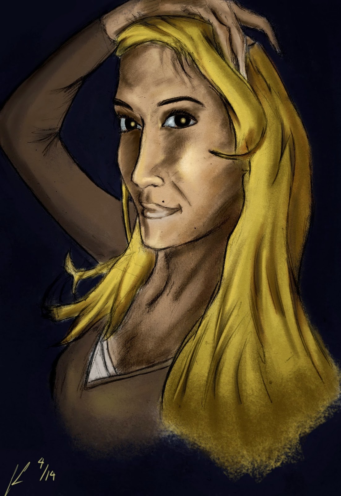
I think this portrait is closest to its photo in look compared to the other portraits I've done. Again, I thought there was a lot of elements I liked in the photo and didn't change much of the structural basics. I tried to keep that
off-center focus and the highlights. Part of me may still think it might be
missing something, but that’s more of me never being satisfied with my own work
as a whole. Not that that’s specifically a bad thing – it just means I can
always keep doing better.
If you've read this much - I thank you. I will be taking a hiatus from portraits. I have two left - sorry, you're gonna have to wait a bit. I'm a little burnt out on portraiture and want to be doing more of my own work again. There's something reserved about these portraits, which can be good, but I need to go a little crazy with my art. Next post, I hope to show something completely different.
And of course, thanks Niove!
And of course, thanks Niove!
.jpg)

